


A working list of the speaker sites doing the messaging, design, and conversion work other speakers should be studying.
TLDR
The speaker websites that actually drive bookings in 2026 share a pattern. After auditing twenty-one sites built for keynote speakers, bestselling authors, and thought leaders, five traits stand out.
- A single ownable phrase above the fold. Not a bio. Not a tagline. A trademarked or registered idea that doubles as the speaker's IP.
- Two CTAs, not seven. The strongest sites pair one booking action with one proof action (watch the reel, read the book).
- Visual social proof inside the hero. A testimonial line, a logo bar, a video clip, or a ranking signal. The first scroll never has to ask "is this person credible."
- Audience segmentation in the navigation. Meeting planners, corporate buyers, and education audiences are routed to different paths from the first click.
- Editorial typography. Massive type, restrained palettes, and one cinematic image. Less stock, more art direction.
Why Does a Speaker Website Matter in 2026?
Event planners are doing their research before they pick up the phone. A widely cited Gartner study found that B2B buyers spend only seventeen percent of their total purchase journey actually meeting with potential suppliers, which means the other eighty-three percent happens on websites, search results, and AI tools. For keynote speakers, that math is brutal. By the time a meeting planner books a discovery call, they have already formed an opinion about whether the speaker is the right fit.
A speaker website is the first audition. Stanford research has consistently shown that visitors form an opinion about a website's credibility within fifty milliseconds, which is faster than a conscious thought. That snap judgment determines whether the planner sends the inquiry, books the call, or moves on to the next name on the shortlist.
The best speaker sites in 2026 understand this. They lead with a single ownable idea, route visitors to one obvious next step, and treat every pixel above the fold as inventory. The list below is a working tour of speakers who have built sites worth studying.
"You don't have a content problem. You have a clarity problem. Speakers who get booked have a website that tells planners exactly what they get, exactly who it's for, and exactly what happens next."
Which Speaker Websites Actually Convert?
Paul Epstein
"WIN MONDAY®" is registered as a habit-led brand promise. The stage photograph carries the hero, with the green wordmark sitting over it at maximum scale. Twin CTAs above the fold (Watch Paul In Action and Book Paul) let bureaus and event planners self-segment by intent. Restrained nav, single proof signal, conversion-focused layout.

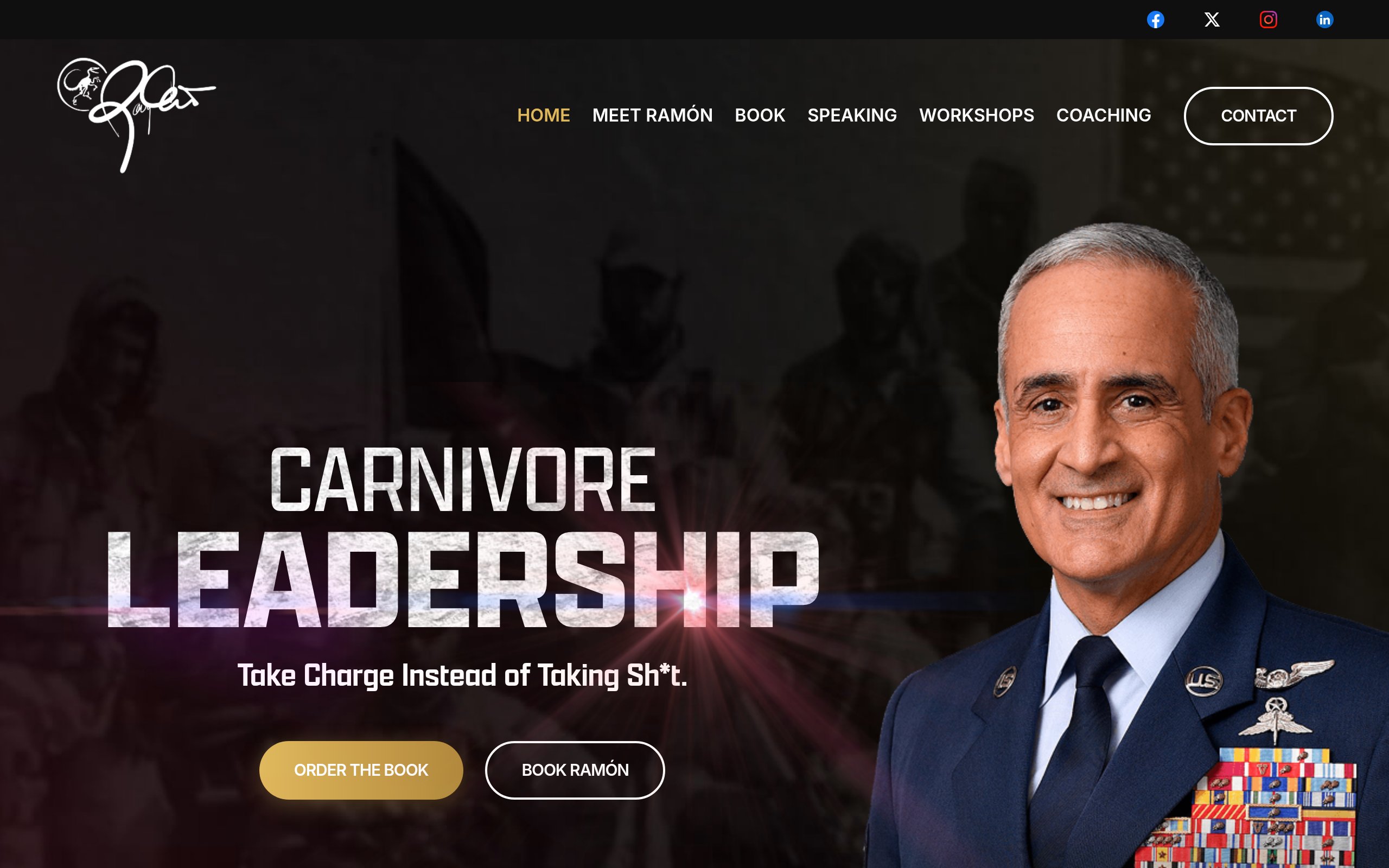
Ramón Colón-López (Carnivore Leader)
A retired senior military officer leans into a polarizing brand stance with "Take Charge Instead of Taking Sh*t." Most leadership sites soften the message. This one sharpens it. The book-first CTA paired with a speaker booking CTA signals a hybrid funnel built for both IP sales and stage bookings.
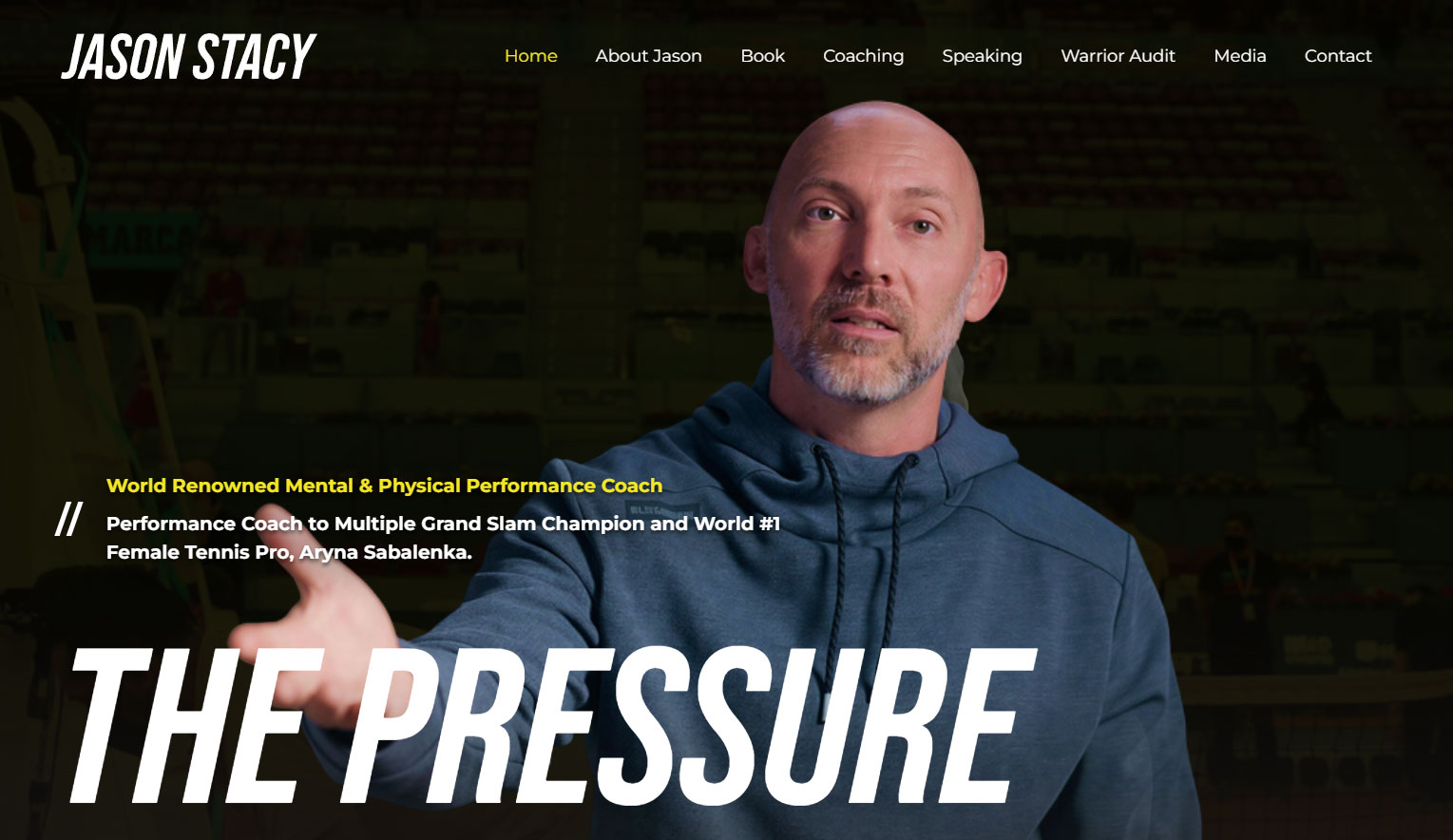
Jason Stacy (The Pressure Code)
The credibility hook leads: "Performance Coach to Multiple Grand Slam Champion and World #1 Female Tennis Pro, Aryna Sabalenka." A high-profile client name above the fold removes the bureau's first question. The black-and-yellow palette mirrors high-performance branding cues found across athletics and elite coaching.
Arshay Cooper
Movement-first framing with "Together, We Become More." A portrait crop dominates the layout, with three CTAs splitting traffic into book buyers, speaking inquiries, and foundation supporters. Cinematic art direction gives the site the feel of a documentary trailer rather than a service page.

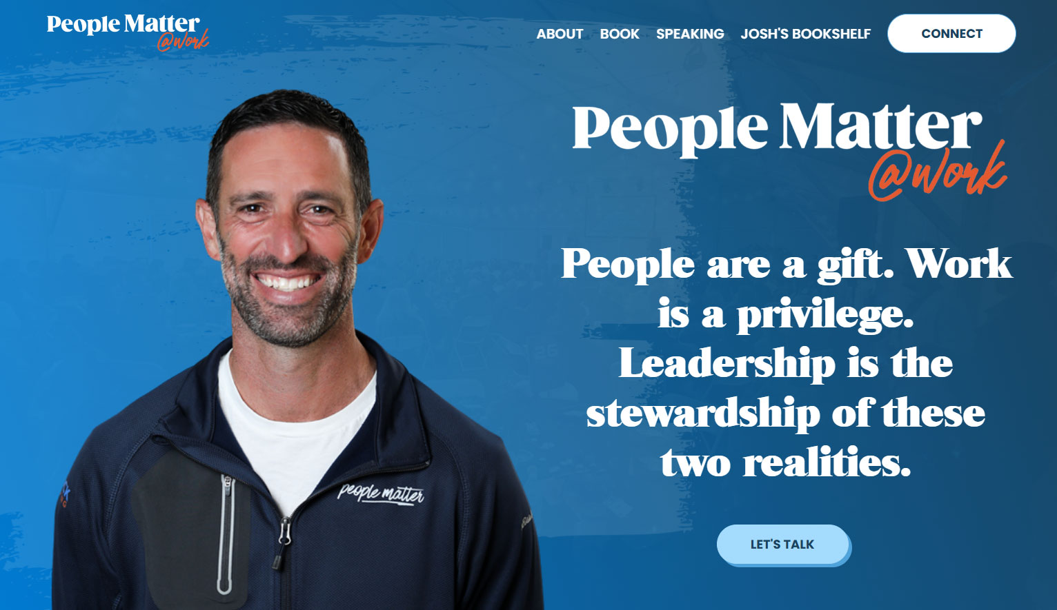
People Matter @ Work
The brand sits ahead of the person. Josh leads with a philosophical statement rather than a name: "People are a gift. Work is a privilege. Leadership is the stewardship of these two realities." A single CTA, "Let's Talk," keeps the funnel narrow and qualified.
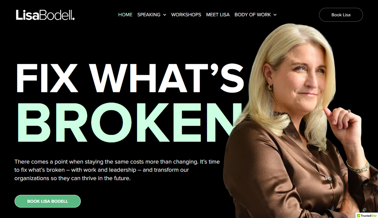
Lisa Bodell
"FIX WHAT'S BROKEN" runs at editorial-cover scale. The portrait, lit and posed like a Forbes feature, balances the type. Below the hero sits a sharp 50-word manifesto and one CTA. Restraint is the design choice, and it works.
Ray Santerini
Trademarked "GO ALL IN™" frames the hero. A neon yellow CTA contrasts against deep navy blue. A video tile sits beside the headline with the on-screen line "It lies!" creating an instant curiosity hook. The nav segments by buyer journey: Meet Ray, Keynote Speaking, Workshops, Meeting Planners.

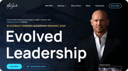
Mike Sarraille
The authority signal lives in the kicker: "#3 Globally Ranked Leadership Speaker | 2026." Hero is anchored by "Evolved Leadership" with twin CTAs (Book Mike, Watch Speaking Reel). The compact layout signals confidence. The ranking carries the weight.
Dr. Brooklyn Raney
Massive blue typography ("TRUST CHANGES EVERYTHING") on a white paper texture. Two CTAs segment by audience: "Education & Youth Serving Organizations" and "Workplace & Corporate Teams." A smart move for a speaker working two distinct industries simultaneously without diluting either.

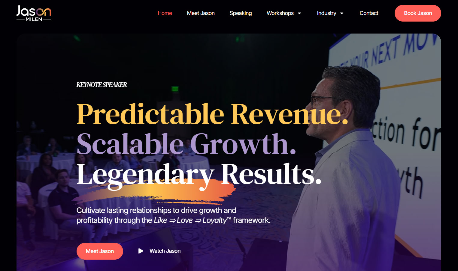
Jason Milen
A three-line promise stack: "Predictable Revenue. Scalable Growth. Legendary Results." A brushstroke graphic accents the outcome. Below the headline sits the "Like → Love → Loyalty™" framework. Buyers see the structure of the IP before they ever read the bio.
Christian "Boo" Boucousis
Fighter-pilot positioning made visual: silhouettes of fighter jets fill the background. "FLAWLESS LEADERSHIP" sits beside the tagline "Igniting the World's Leadership Potential." A live video tile beneath the CTAs gives bureaus a five-second proof point without leaving the page.

Dan Varroney
Light-mode design, which is rare in this category. "IGNITE AMERICA'S GROWTH ENGINE" pulls from his book and policy positioning. Executive portrait, navy and white palette, twin CTAs (Request Dan, Order The Book) drive both speaking and IP sales from the same hero.

Nicole Van Valen
"Joy Powered PERFORMANCE™" lands as the framework name. The subhead anchors the science: "energy, presence, and results for leaders, teams, and cultures that thrive under pressure." Two CTAs split intent: Watch Nicole in Action and Schedule an Exploratory Call.

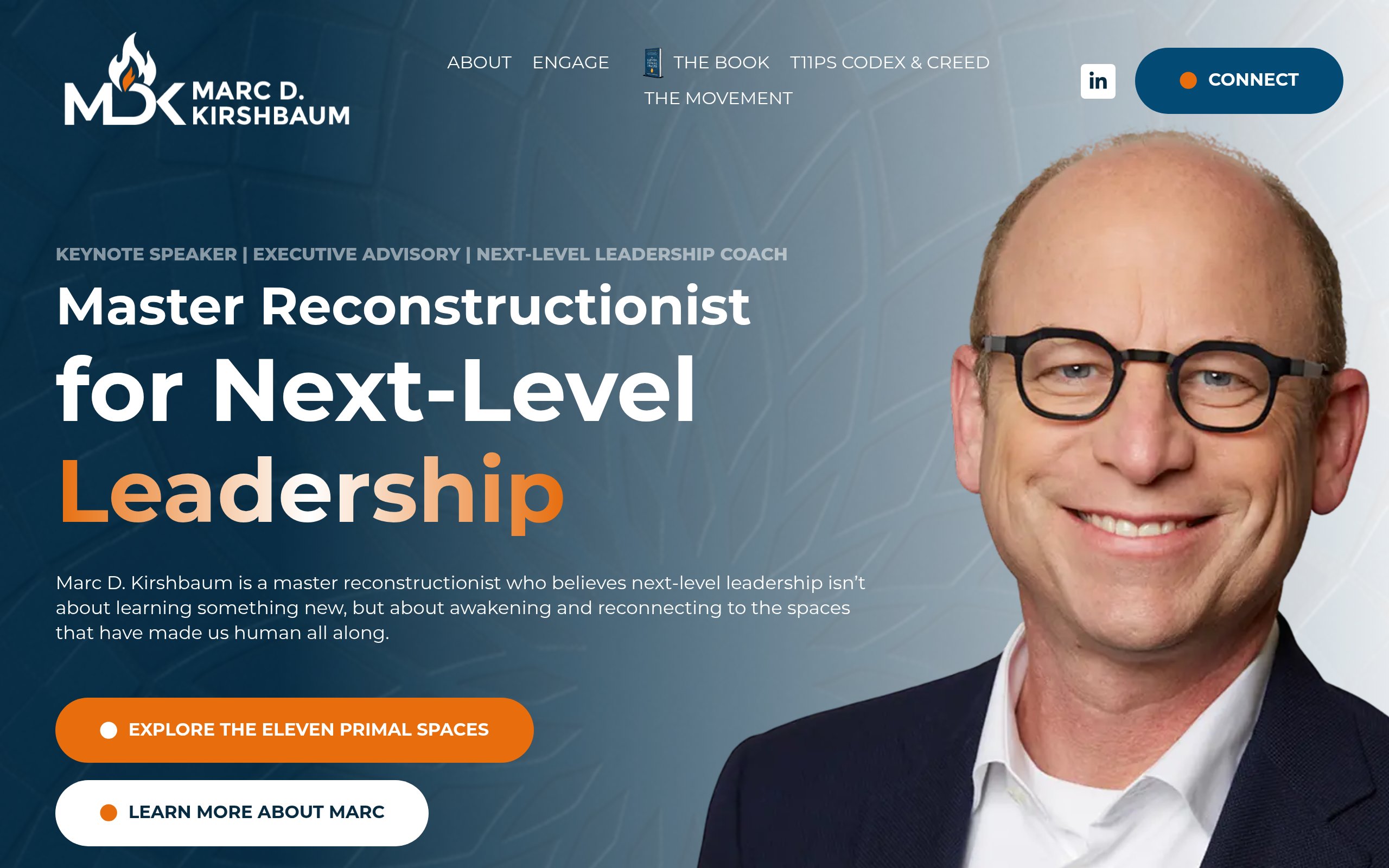
Marc D. Kirshbaum
The headline does the heavy lifting: "Master Reconstructionist for Next-Level Leadership." The IP name "The Eleven Primal Spaces" is woven into the primary CTA. Three positioning signals stack above the headline (Keynote Speaker | Executive Advisory | Next-Level Leadership Coach), telegraphing the full offer.
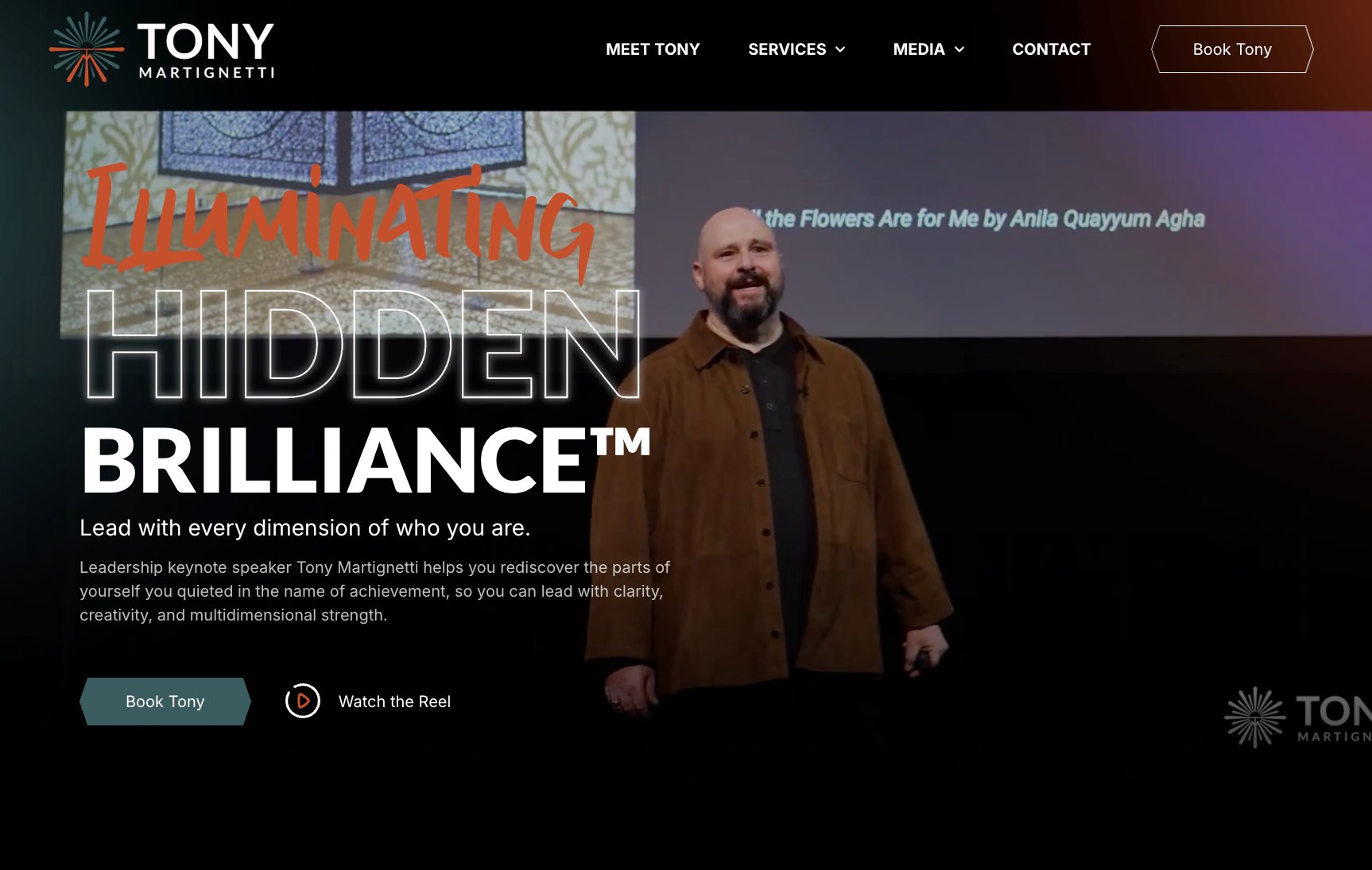
Tony Martignetti
Layered typography effect: "ILLUMINATING" in script lettering, "HIDDEN BRILLIANCE™" in outlined block letters. A stage photograph anchors the backdrop. Two CTAs, Book Tony and Watch the Reel, sit at the bottom of the hero in a textbook above-the-fold pattern.
Martha McSally
"Be Unbreakable." A brushstroke underline accents the headline. The background is a layered composite of her flight-suit history and current professional photography. The subhead frames the audience promise: "Lead Yourself First in a World That Never Slows Down."

Seth Yelorda
"LEAD WITH CLARITY™" pulls in three accented words ("science-backed," "elevate," "extraordinary results") to telegraph the value prop without long copy. The booking CTA repeats in the top-right with a face icon, which is a small touch that lifts click-through on intent buttons.

Josh Linkner
An editorial black-and-white portrait fills the left half. The right side carries "Find A Way™" with subhead positioning the IP as "A practical innovation system." A watch CTA and a "Partner With Josh" button signal partner-friendly framing typical of established keynoters with deep bureau relationships.

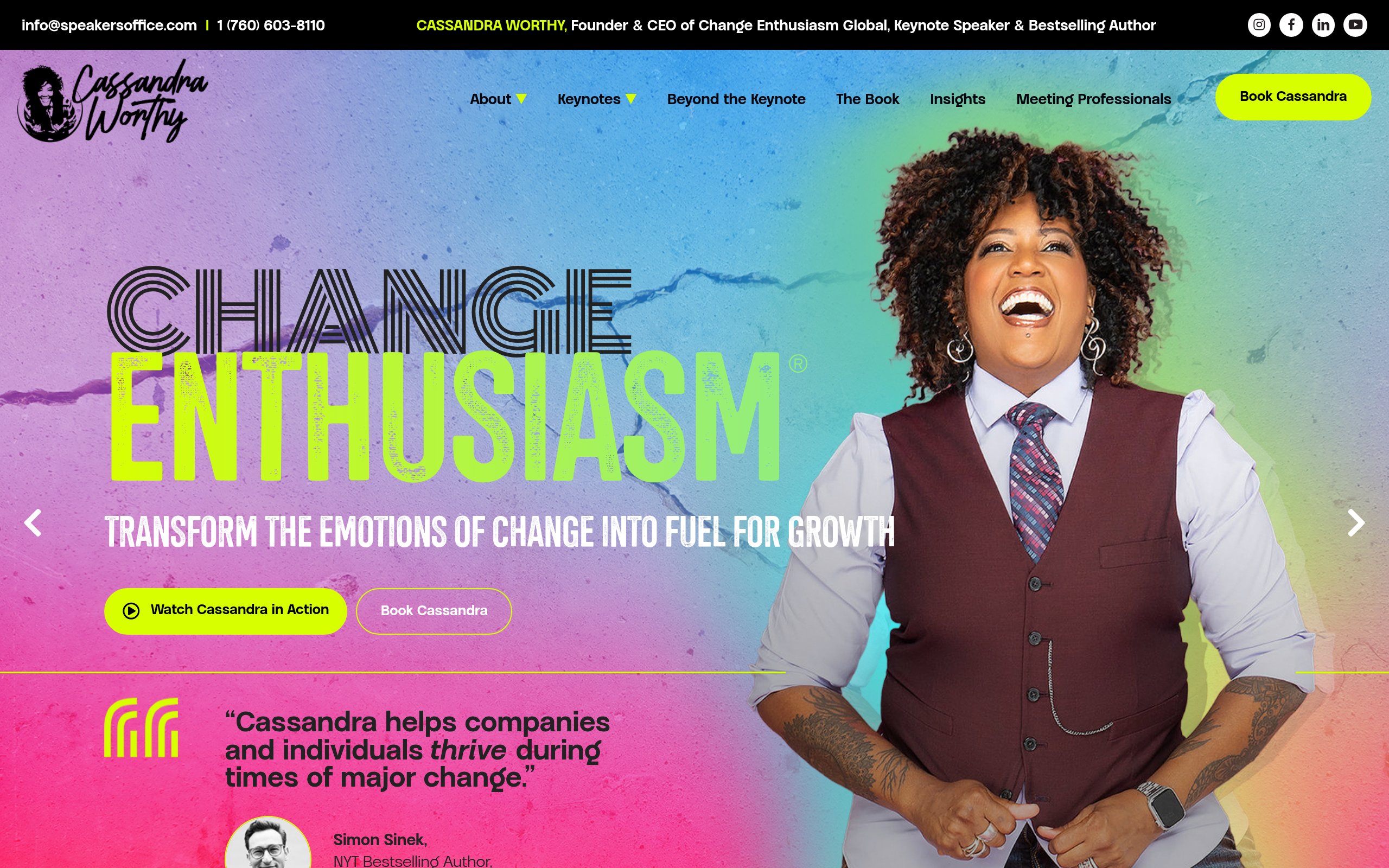
Cassandra Worthy
"CHANGE ENTHUSIASM®" is registered as the core idea. A bright pink-to-blue gradient gives the site distinct shelf appeal in a sea of muted speaker sites. Simon Sinek's name appears above the fold as social proof, which functions as a credential transfer. Two clear CTAs round out the hero.
Chad E. Foster
A promo bar at the top markets the bestseller. The hero stacks "CHAD E. FOSTER" over a stage photograph (sunglasses, tailored suit, blind ambition positioning made literal). The subhead "KEYNOTE SPEAKER | BLIND AMBITION AT WORK™" is layered behind the photo. A testimonial peeks above the fold edge.

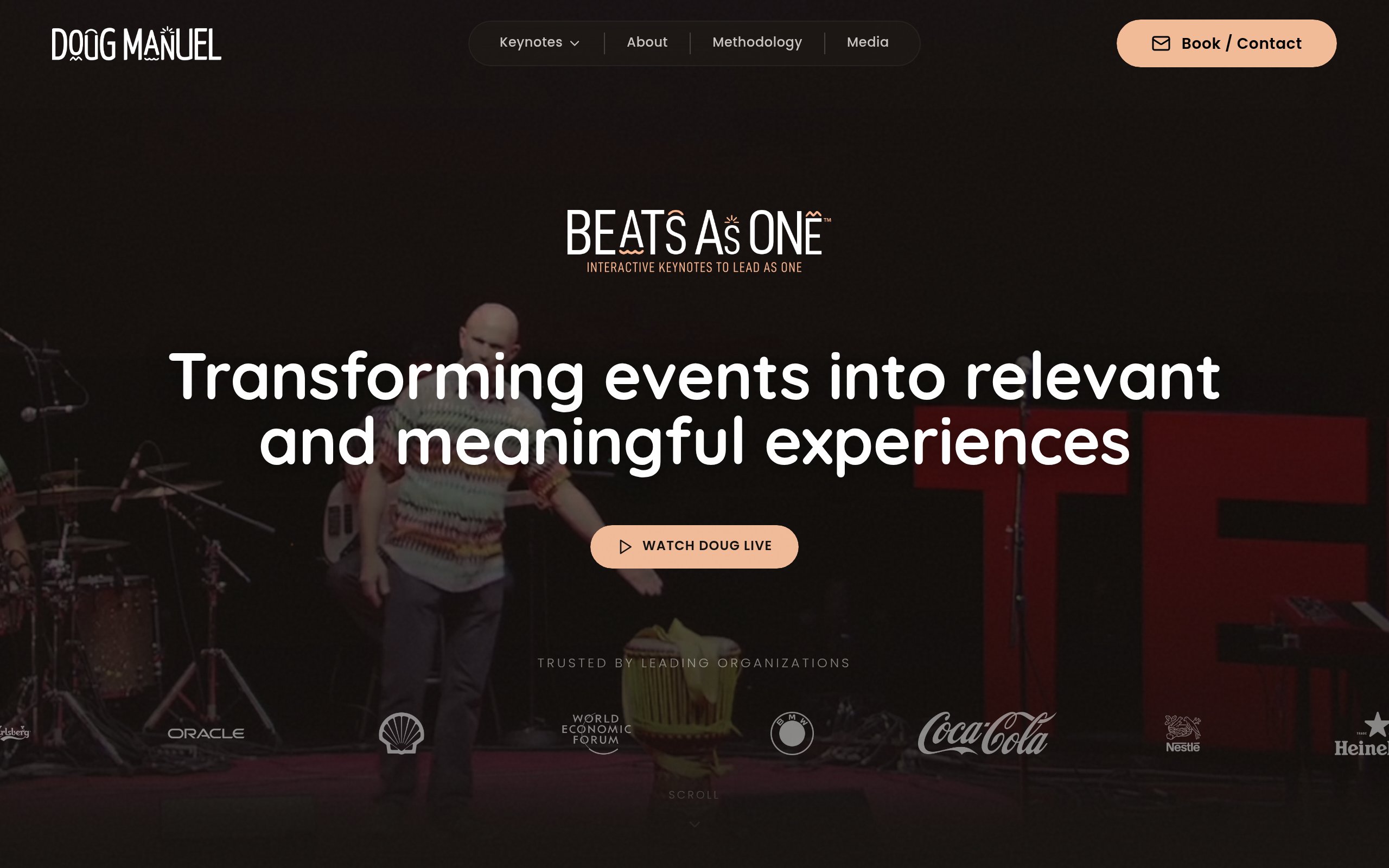
Doug Manuel
"Beats As One™" frames Doug's offer as interactive keynotes that lead as one. The hero pairs a live stage shot with a logo bar (Oracle, Shell, World Economic Forum, BMW, Coca-Cola, Nestlé, Heineken, Carlsberg) the moment the page loads. Social proof of that caliber answers the credibility question before the first scroll.
What Do These Websites Have in Common?
Twenty-one sites, twenty-one different speakers, one shared playbook. After looking across the set, seven patterns repeat.
- Trademarked or registered IP in the headline. "WIN MONDAY®," "GO ALL IN™," "CHANGE ENTHUSIASM®," "Joy Powered PERFORMANCE™," "LEAD WITH CLARITY™," "FIND A WAY™." The word mark is the framework, and the framework is the offer.
- One image, treated like a magazine cover. Custom photography, dramatic lighting, careful crop. Stock imagery is absent across the board.
- Two CTAs above the fold. One booking-intent button, one proof button (watch the reel, read the book, schedule a call). The two-CTA pattern shows up on roughly eighteen of the twenty-one.
- Audience routing inside the hero or top nav. Meeting planners, corporate buyers, education, partners. The buyer gets a path before they scroll.
- Social proof visible on the first scroll. A pull quote, a logo bar, a ranking badge, a client name, an embedded video. The credibility question gets answered before it gets asked.
- Editorial-scale typography. Headlines run at sizes most websites would consider absurd. This is intentional. Type carries the emotional weight, which lets the copy stay short.
- Restraint over abundance. Three sections above the fold, not nine. One headline, not three. One value prop, not five.
"The job of the hero section is not to tell visitors everything about you. It is to give them one reason to scroll, and one reason to book. That's it."
According to HubSpot's research on landing page performance, sites with a single, focused offer convert dramatically better than those with multiple competing CTAs. Speakers building sites this year should treat the hero as a single decision: book or scroll.
Frequently Asked Questions
What should a speaker website include?
At minimum: a clear ownable headline, one professional photograph, a speaker reel, two or three testimonials, a list of keynote topics, a downloadable one-pager, and a booking form. Anything that does not move a meeting planner closer to an inquiry can be cut.
How often should I update my speaker website?
Refresh testimonials and client logos every quarter. Refresh the speaker reel annually. Major design refreshes happen every two to three years, usually triggered by a book launch, a new framework, or a category pivot. Stale sites are a credibility risk.
What is the most important page on a speaker website?
The home page hero. Nielsen Norman Group research shows that visitors spend roughly 57 percent of their on-page time above the fold. If the hero does not communicate who the speaker is, who they are for, and what to do next, the rest of the site cannot save it.
Should my speaker website include video?
Yes. A speaker reel is non-negotiable in 2026. According to Wyzowl's 2024 video marketing report, 89 percent of consumers want to see more video from brands they consider, and meeting planners specifically rank video higher than any other speaker asset when evaluating fit.
How do I make my speaker website rank in AI search?
Write clear, structured content with proper heading hierarchy. Use schema markup. Build genuine backlinks from credible sources. Generative engine optimization (GEO) rewards sites that answer specific questions directly, cite credible sources, and avoid keyword stuffing. AI tools like ChatGPT and Perplexity are pulling from the open web more than ever, so the same fundamentals that win Google will increasingly win AI search.
How long should the copy be on a speaker website?
Short on the home page, deep on the topic pages. Meeting planners want to skim the home page in under thirty seconds. They want to read the keynote topic pages in detail before they reach out. According to scroll-tracking research from Crazy Egg, only about 20 percent of visitors read past the first screen on a service page, so the most important information has to live up top.
Want to Build a Speaker Website That Actually Converts?
If you want a website that does the work these sites are doing, join our free 25-minute webinar on Speaker Websites That Convert. We walk through the frameworks, structure, and messaging patterns that turn a website into inbound speaking inquiries. Save your seat here.
Further reading: The Elements of Value (Harvard Business Review), The Anatomy of a High-Converting Landing Page (Forbes), and CXL's conversion research archive.
A working list of the speaker sites doing the messaging, design, and conversion work other speakers should be studying.
TLDR
The speaker websites that actually drive bookings in 2026 share a pattern. After auditing twenty-one sites built for keynote speakers, bestselling authors, and thought leaders, five traits stand out.
- A single ownable phrase above the fold. Not a bio. Not a tagline. A trademarked or registered idea that doubles as the speaker's IP.
- Two CTAs, not seven. The strongest sites pair one booking action with one proof action (watch the reel, read the book).
- Visual social proof inside the hero. A testimonial line, a logo bar, a video clip, or a ranking signal. The first scroll never has to ask "is this person credible."
- Audience segmentation in the navigation. Meeting planners, corporate buyers, and education audiences are routed to different paths from the first click.
- Editorial typography. Massive type, restrained palettes, and one cinematic image. Less stock, more art direction.
Why Does a Speaker Website Matter in 2026?
Event planners are doing their research before they pick up the phone. A widely cited Gartner study found that B2B buyers spend only seventeen percent of their total purchase journey actually meeting with potential suppliers, which means the other eighty-three percent happens on websites, search results, and AI tools. For keynote speakers, that math is brutal. By the time a meeting planner books a discovery call, they have already formed an opinion about whether the speaker is the right fit.
A speaker website is the first audition. Stanford research has consistently shown that visitors form an opinion about a website's credibility within fifty milliseconds, which is faster than a conscious thought. That snap judgment determines whether the planner sends the inquiry, books the call, or moves on to the next name on the shortlist.
The best speaker sites in 2026 understand this. They lead with a single ownable idea, route visitors to one obvious next step, and treat every pixel above the fold as inventory. The list below is a working tour of speakers who have built sites worth studying.
"You don't have a content problem. You have a clarity problem. Speakers who get booked have a website that tells planners exactly what they get, exactly who it's for, and exactly what happens next."
Which Speaker Websites Actually Convert?
Paul Epstein
"WIN MONDAY®" is registered as a habit-led brand promise. The stage photograph carries the hero, with the green wordmark sitting over it at maximum scale. Twin CTAs above the fold (Watch Paul In Action and Book Paul) let bureaus and event planners self-segment by intent. Restrained nav, single proof signal, conversion-focused layout.
Ramón Colón-López (Carnivore Leader)
A retired senior military officer leans into a polarizing brand stance with "Take Charge Instead of Taking Sh*t." Most leadership sites soften the message. This one sharpens it. The book-first CTA paired with a speaker booking CTA signals a hybrid funnel built for both IP sales and stage bookings.
Jason Stacy (The Pressure Code)
The credibility hook leads: "Performance Coach to Multiple Grand Slam Champion and World #1 Female Tennis Pro, Aryna Sabalenka." A high-profile client name above the fold removes the bureau's first question. The black-and-yellow palette mirrors high-performance branding cues found across athletics and elite coaching.
Arshay Cooper
Movement-first framing with "Together, We Become More." A portrait crop dominates the layout, with three CTAs splitting traffic into book buyers, speaking inquiries, and foundation supporters. Cinematic art direction gives the site the feel of a documentary trailer rather than a service page.
People Matter @ Work
The brand sits ahead of the person. Josh leads with a philosophical statement rather than a name: "People are a gift. Work is a privilege. Leadership is the stewardship of these two realities." A single CTA, "Let's Talk," keeps the funnel narrow and qualified.
Lisa Bodell
"FIX WHAT'S BROKEN" runs at editorial-cover scale. The portrait, lit and posed like a Forbes feature, balances the type. Below the hero sits a sharp 50-word manifesto and one CTA. Restraint is the design choice, and it works.
Ray Santerini
Trademarked "GO ALL IN™" frames the hero. A neon yellow CTA contrasts against deep navy blue. A video tile sits beside the headline with the on-screen line "It lies!" creating an instant curiosity hook. The nav segments by buyer journey: Meet Ray, Keynote Speaking, Workshops, Meeting Planners.
Mike Sarraille
The authority signal lives in the kicker: "#3 Globally Ranked Leadership Speaker | 2026." Hero is anchored by "Evolved Leadership" with twin CTAs (Book Mike, Watch Speaking Reel). The compact layout signals confidence. The ranking carries the weight.
Dr. Brooklyn Raney
Massive blue typography ("TRUST CHANGES EVERYTHING") on a white paper texture. Two CTAs segment by audience: "Education & Youth Serving Organizations" and "Workplace & Corporate Teams." A smart move for a speaker working two distinct industries simultaneously without diluting either.
Jason Milen
A three-line promise stack: "Predictable Revenue. Scalable Growth. Legendary Results." A brushstroke graphic accents the outcome. Below the headline sits the "Like → Love → Loyalty™" framework. Buyers see the structure of the IP before they ever read the bio.
Christian "Boo" Boucousis
Fighter-pilot positioning made visual: silhouettes of fighter jets fill the background. "FLAWLESS LEADERSHIP" sits beside the tagline "Igniting the World's Leadership Potential." A live video tile beneath the CTAs gives bureaus a five-second proof point without leaving the page.
Dan Varroney
Light-mode design, which is rare in this category. "IGNITE AMERICA'S GROWTH ENGINE" pulls from his book and policy positioning. Executive portrait, navy and white palette, twin CTAs (Request Dan, Order The Book) drive both speaking and IP sales from the same hero.
Nicole Van Valen
"Joy Powered PERFORMANCE™" lands as the framework name. The subhead anchors the science: "energy, presence, and results for leaders, teams, and cultures that thrive under pressure." Two CTAs split intent: Watch Nicole in Action and Schedule an Exploratory Call.
Marc D. Kirshbaum
The headline does the heavy lifting: "Master Reconstructionist for Next-Level Leadership." The IP name "The Eleven Primal Spaces" is woven into the primary CTA. Three positioning signals stack above the headline (Keynote Speaker | Executive Advisory | Next-Level Leadership Coach), telegraphing the full offer.
Tony Martignetti
Layered typography effect: "ILLUMINATING" in script lettering, "HIDDEN BRILLIANCE™" in outlined block letters. A stage photograph anchors the backdrop. Two CTAs, Book Tony and Watch the Reel, sit at the bottom of the hero in a textbook above-the-fold pattern.
Martha McSally
"Be Unbreakable." A brushstroke underline accents the headline. The background is a layered composite of her flight-suit history and current professional photography. The subhead frames the audience promise: "Lead Yourself First in a World That Never Slows Down."
Seth Yelorda
"LEAD WITH CLARITY™" pulls in three accented words ("science-backed," "elevate," "extraordinary results") to telegraph the value prop without long copy. The booking CTA repeats in the top-right with a face icon, which is a small touch that lifts click-through on intent buttons.
Josh Linkner
An editorial black-and-white portrait fills the left half. The right side carries "Find A Way™" with subhead positioning the IP as "A practical innovation system." A watch CTA and a "Partner With Josh" button signal partner-friendly framing typical of established keynoters with deep bureau relationships.
Cassandra Worthy
"CHANGE ENTHUSIASM®" is registered as the core idea. A bright pink-to-blue gradient gives the site distinct shelf appeal in a sea of muted speaker sites. Simon Sinek's name appears above the fold as social proof, which functions as a credential transfer. Two clear CTAs round out the hero.
Chad E. Foster
A promo bar at the top markets the bestseller. The hero stacks "CHAD E. FOSTER" over a stage photograph (sunglasses, tailored suit, blind ambition positioning made literal). The subhead "KEYNOTE SPEAKER | BLIND AMBITION AT WORK™" is layered behind the photo. A testimonial peeks above the fold edge.
Doug Manuel
"Beats As One™" frames Doug's offer as interactive keynotes that lead as one. The hero pairs a live stage shot with a logo bar (Oracle, Shell, World Economic Forum, BMW, Coca-Cola, Nestlé, Heineken, Carlsberg) the moment the page loads. Social proof of that caliber answers the credibility question before the first scroll.
What Do These Websites Have in Common?
Twenty-one sites, twenty-one different speakers, one shared playbook. After looking across the set, seven patterns repeat.
- Trademarked or registered IP in the headline. "WIN MONDAY®," "GO ALL IN™," "CHANGE ENTHUSIASM®," "Joy Powered PERFORMANCE™," "LEAD WITH CLARITY™," "FIND A WAY™." The word mark is the framework, and the framework is the offer.
- One image, treated like a magazine cover. Custom photography, dramatic lighting, careful crop. Stock imagery is absent across the board.
- Two CTAs above the fold. One booking-intent button, one proof button (watch the reel, read the book, schedule a call). The two-CTA pattern shows up on roughly eighteen of the twenty-one.
- Audience routing inside the hero or top nav. Meeting planners, corporate buyers, education, partners. The buyer gets a path before they scroll.
- Social proof visible on the first scroll. A pull quote, a logo bar, a ranking badge, a client name, an embedded video. The credibility question gets answered before it gets asked.
- Editorial-scale typography. Headlines run at sizes most websites would consider absurd. This is intentional. Type carries the emotional weight, which lets the copy stay short.
- Restraint over abundance. Three sections above the fold, not nine. One headline, not three. One value prop, not five.
"The job of the hero section is not to tell visitors everything about you. It is to give them one reason to scroll, and one reason to book. That's it."
According to HubSpot's research on landing page performance, sites with a single, focused offer convert dramatically better than those with multiple competing CTAs. Speakers building sites this year should treat the hero as a single decision: book or scroll.
Frequently Asked Questions
What should a speaker website include?
At minimum: a clear ownable headline, one professional photograph, a speaker reel, two or three testimonials, a list of keynote topics, a downloadable one-pager, and a booking form. Anything that does not move a meeting planner closer to an inquiry can be cut.
How often should I update my speaker website?
Refresh testimonials and client logos every quarter. Refresh the speaker reel annually. Major design refreshes happen every two to three years, usually triggered by a book launch, a new framework, or a category pivot. Stale sites are a credibility risk.
What is the most important page on a speaker website?
The home page hero. Nielsen Norman Group research shows that visitors spend roughly 57 percent of their on-page time above the fold. If the hero does not communicate who the speaker is, who they are for, and what to do next, the rest of the site cannot save it.
Should my speaker website include video?
Yes. A speaker reel is non-negotiable in 2026. According to Wyzowl's 2024 video marketing report, 89 percent of consumers want to see more video from brands they consider, and meeting planners specifically rank video higher than any other speaker asset when evaluating fit.
How do I make my speaker website rank in AI search?
Write clear, structured content with proper heading hierarchy. Use schema markup. Build genuine backlinks from credible sources. Generative engine optimization (GEO) rewards sites that answer specific questions directly, cite credible sources, and avoid keyword stuffing. AI tools like ChatGPT and Perplexity are pulling from the open web more than ever, so the same fundamentals that win Google will increasingly win AI search.
How long should the copy be on a speaker website?
Short on the home page, deep on the topic pages. Meeting planners want to skim the home page in under thirty seconds. They want to read the keynote topic pages in detail before they reach out. According to scroll-tracking research from Crazy Egg, only about 20 percent of visitors read past the first screen on a service page, so the most important information has to live up top.
Want to Build a Speaker Website That Actually Converts?
If you want a website that does the work these sites are doing, join our free 25-minute webinar on Speaker Websites That Convert. We walk through the frameworks, structure, and messaging patterns that turn a website into inbound speaking inquiries. Save your seat here.
Further reading: The Elements of Value (Harvard Business Review), The Anatomy of a High-Converting Landing Page (Forbes), and CXL's conversion research archive.


